
Le Petit Ballon is a French wine subscription service offering novices and experts alike a new way to explore wine. After years of fruitful collaboration they approached us to help them reimagine their brand from the ground up.
The objective was not only to modernise the illustration style, but also to realign the look-and-feel with the essence of their product and values.
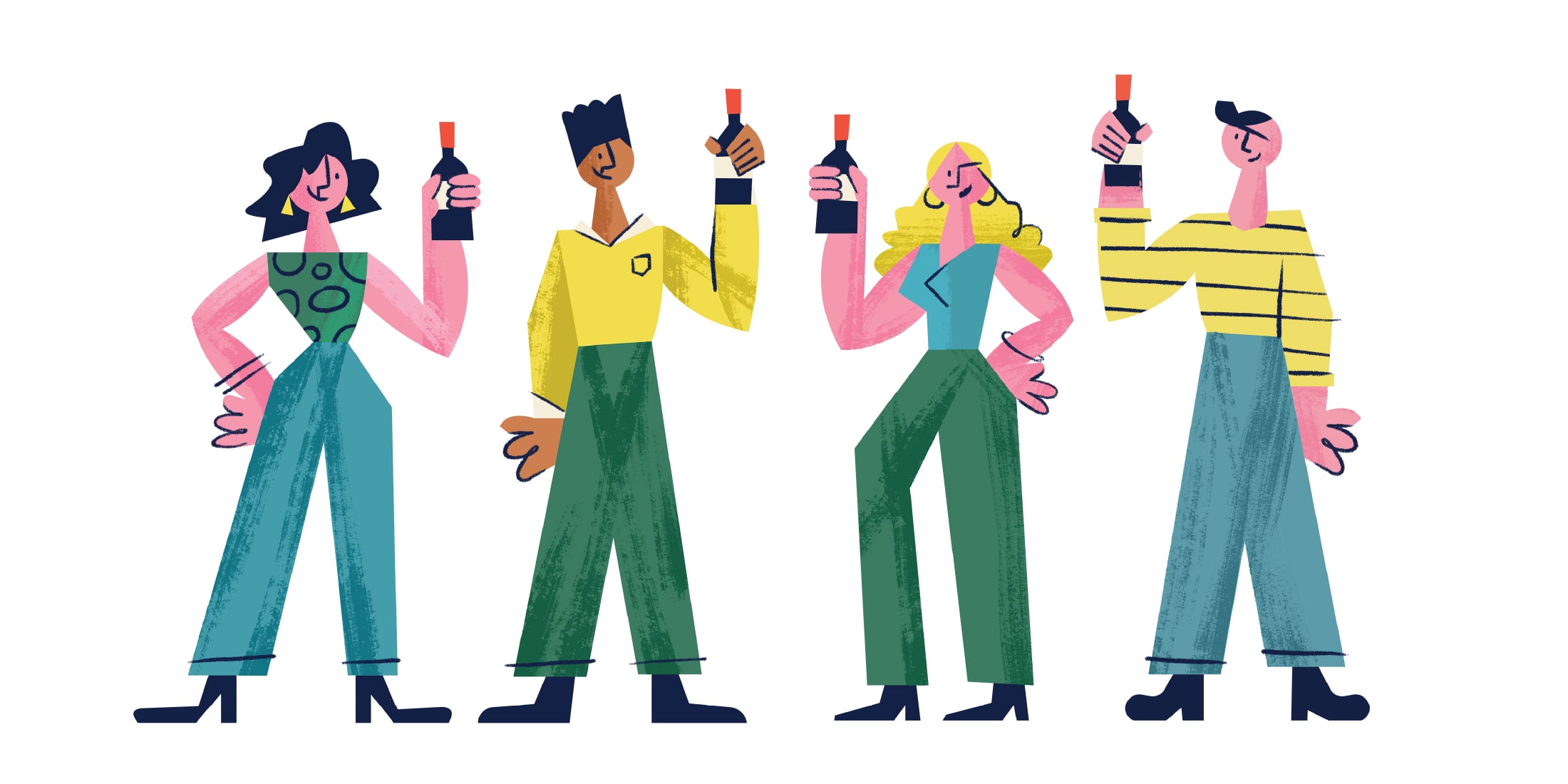
We’ve worked with Le Petit Ballon since 2016 to expand on their distinct geometric and clean brand illustration style, grounded in their clean and modern approach towards being an online wine shop and subscription service. But just like a good wine, the company matured into a bolder, richer and dynamic personality, and a new artistic language was needed to help the company grow and tell their stories.

To reconnect the brand to Le Petit Ballon’s core offering and product, we revisited what their brand stands for and aims to accomplish. We returned anew to the multifaceted characteristics of wine and how it can be expressed visually in a modern and artistic way.

Wine is complex, yet simple. Deep or light and anything in-between. It can be as personal and expressive as an artwork in the Louvre or on your bedroom wall. Thus the new visual language of Le Petit Ballon needs to be able to carry the diversity and expressive nature of what we often find in a bottle. We narrowed our approach down to these four basic principles.


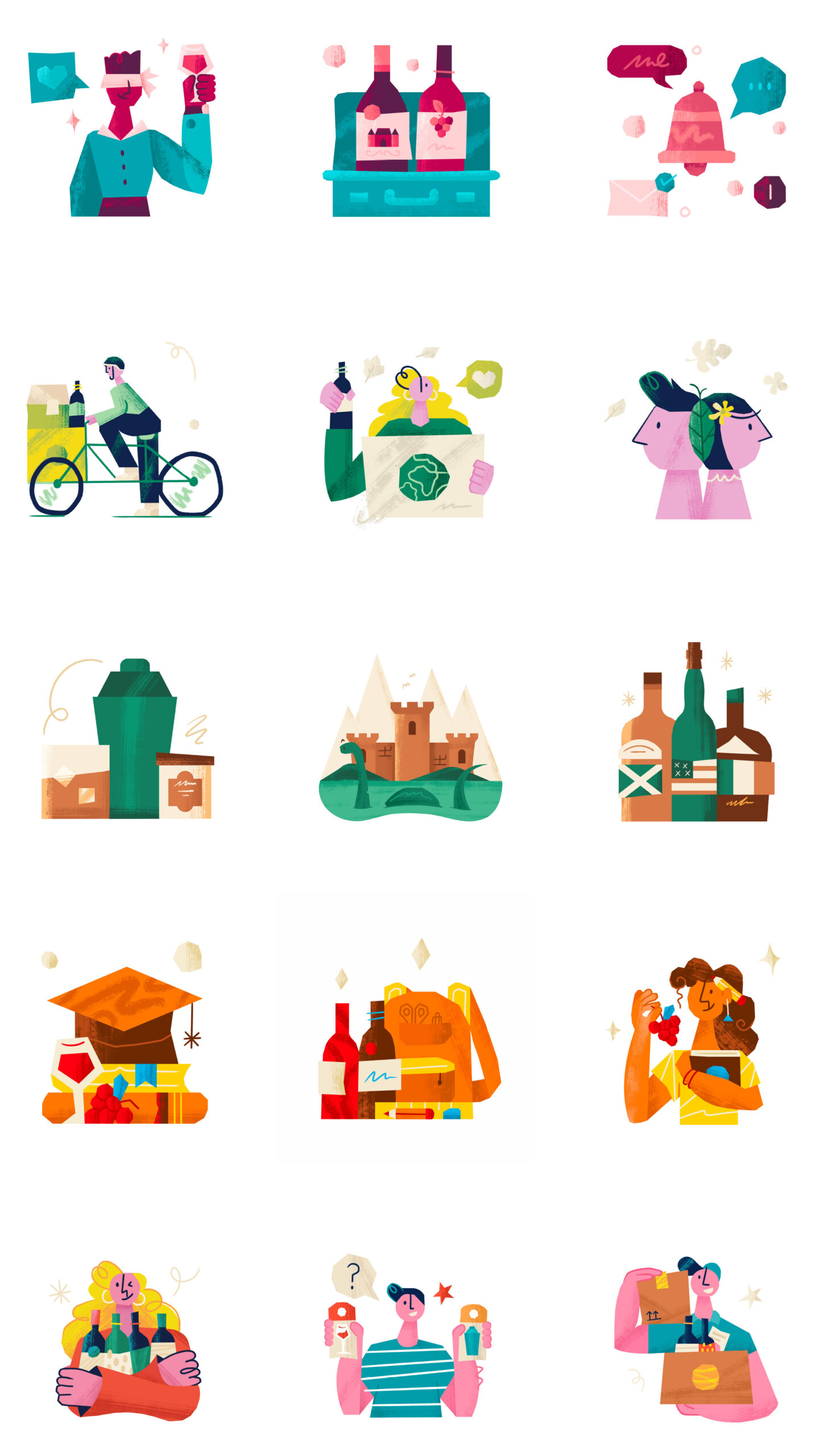
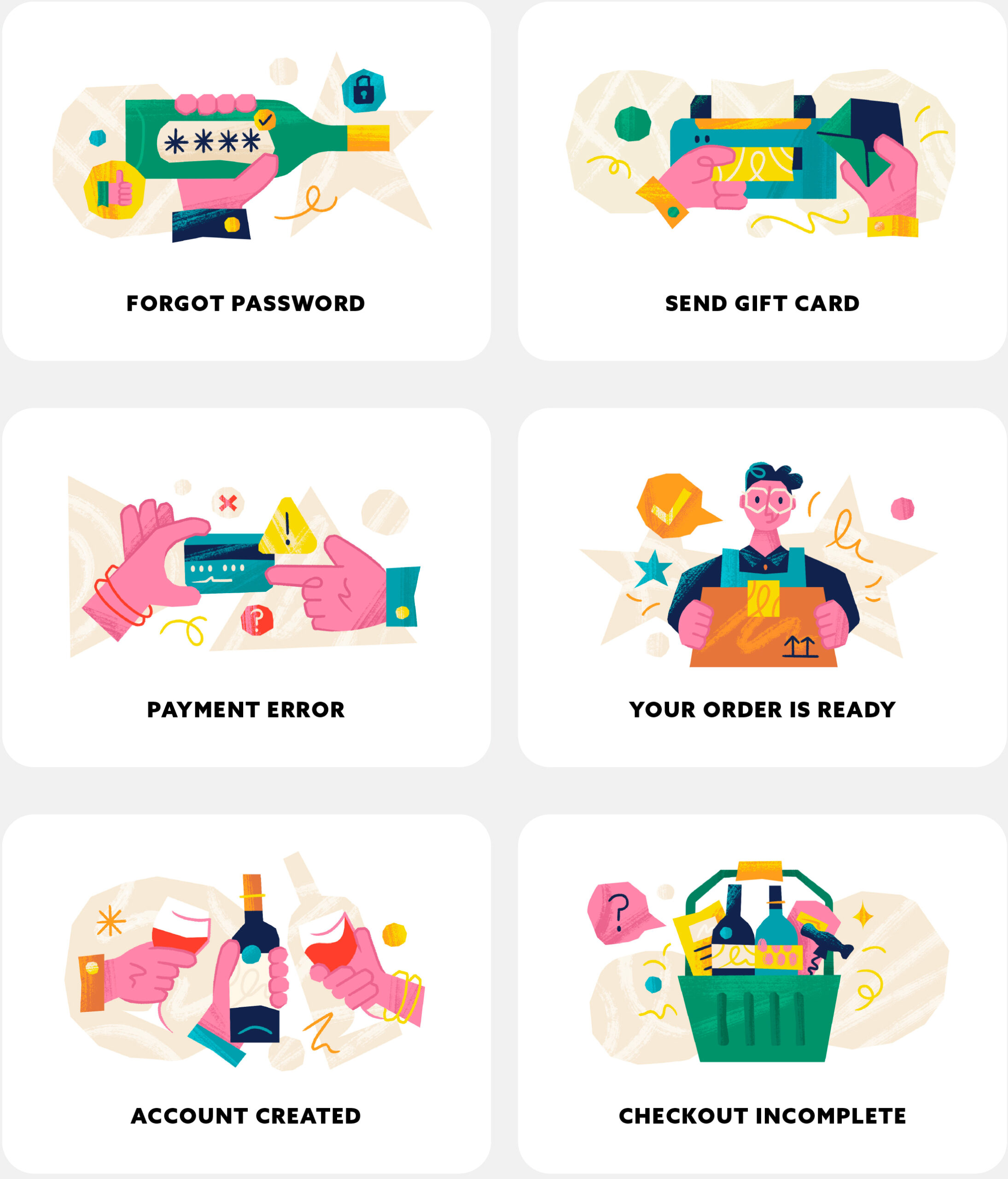
Spot Illustrations are used throughout the online store, website and mobile app to guide and inform the user about various steps to follow a process or to showcase different options available.
We create new spot illustrations for different promotions or themed special editions.
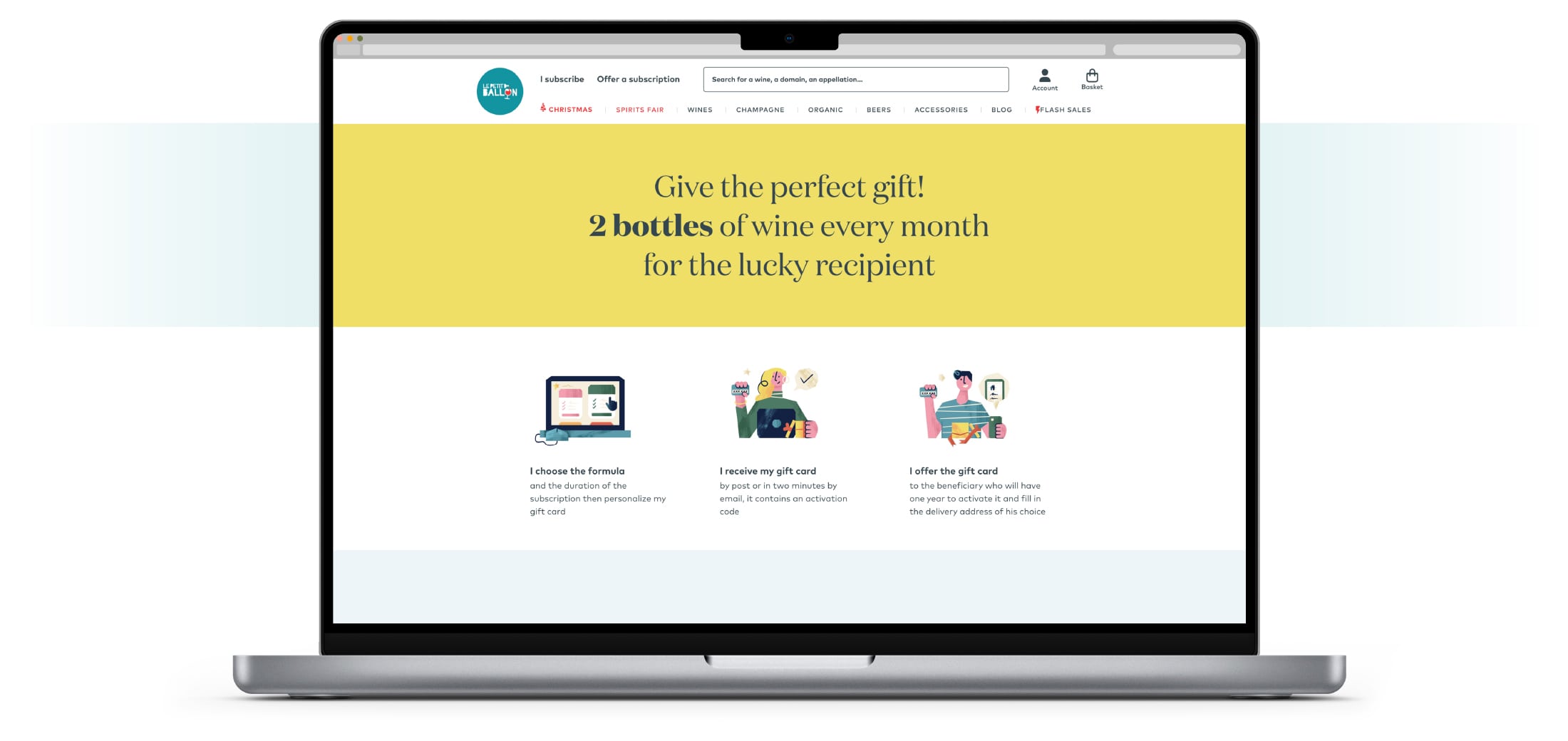
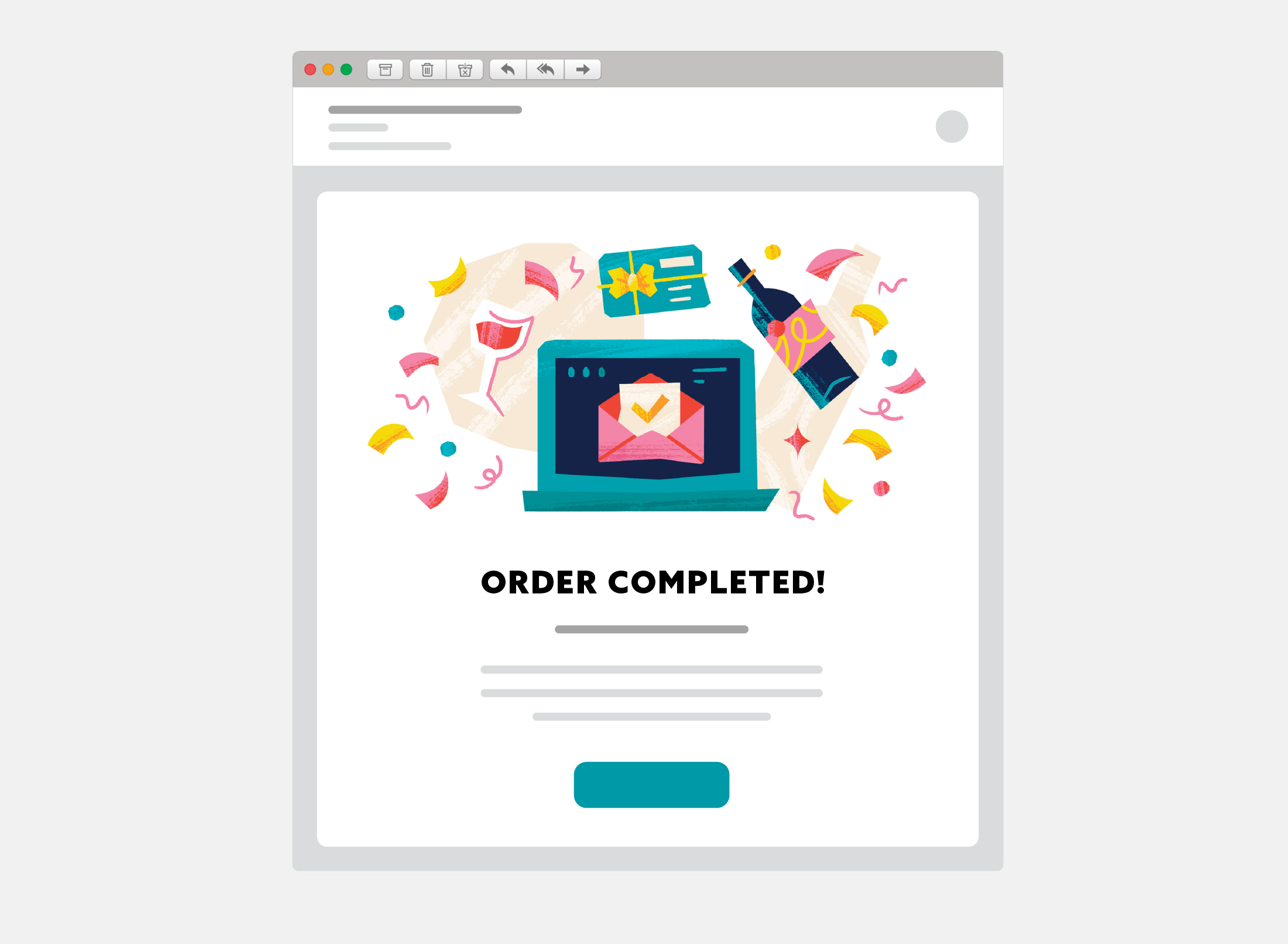
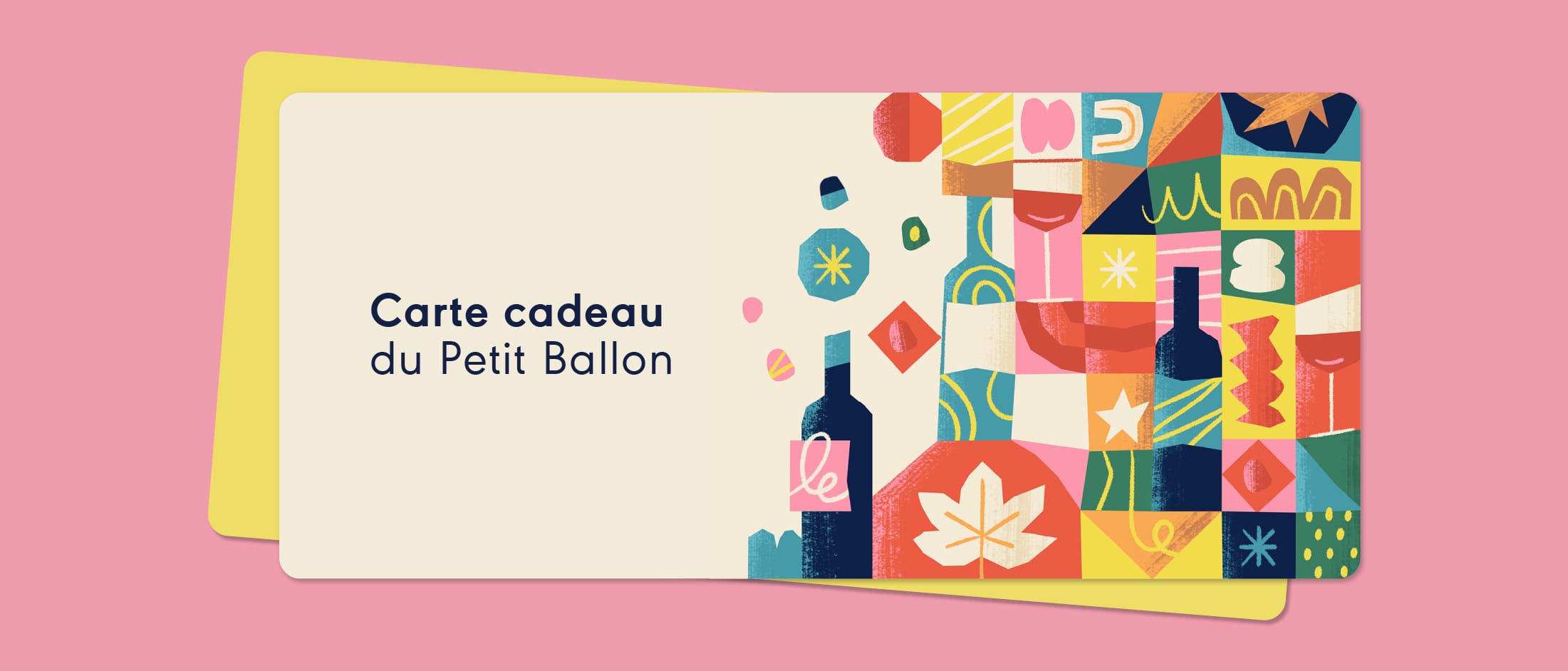
No spam here! From new subscriber to old time buyer, there’s an email banner for everyone to feel welcomed, helped and informed. Members get regular email updates and reminders about important aspects of their subscription, recent orders and gift cards.
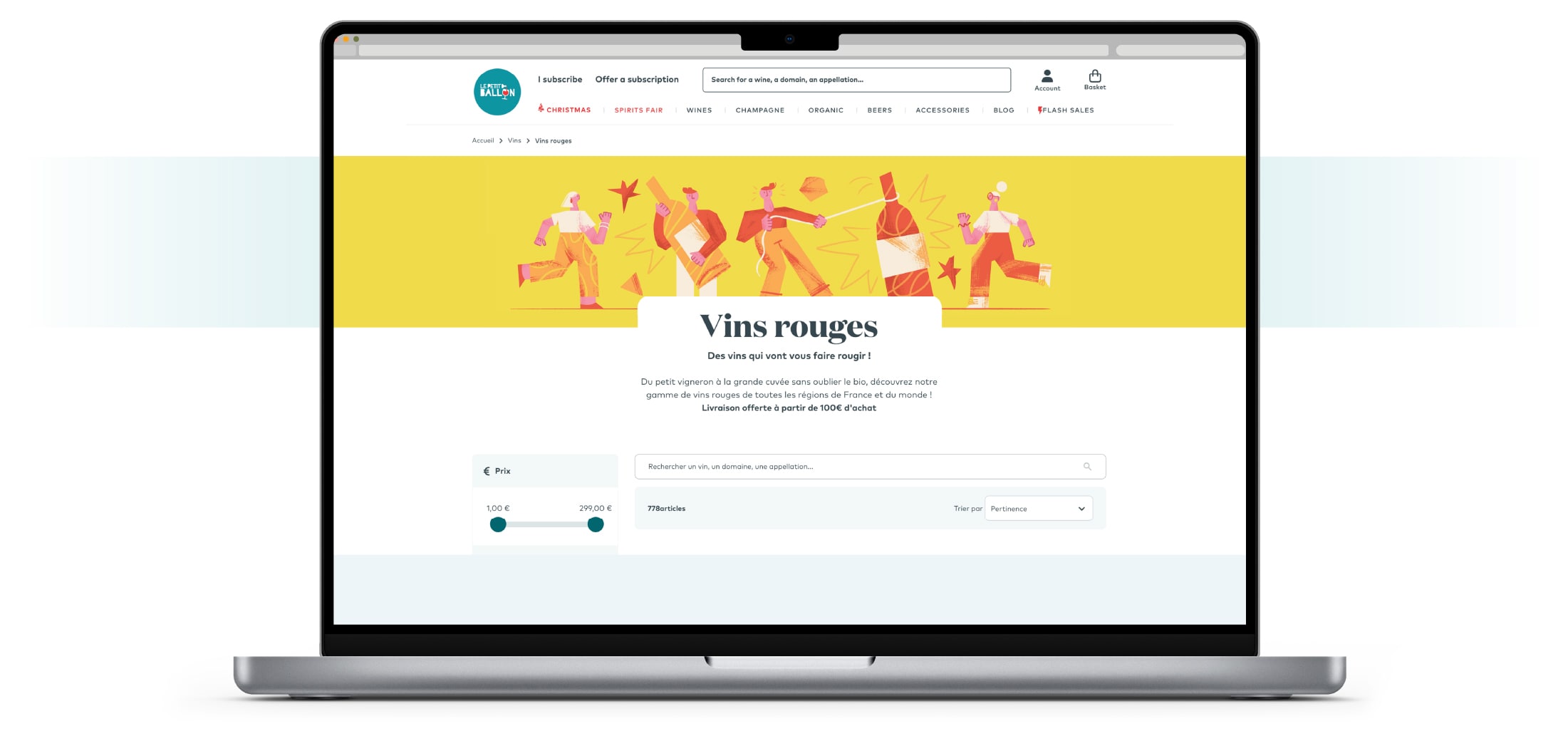
Whether it’s a birthday, Christmas, Halloween or just a Friday, there’s always special packages and promotions to match the occasion. Monthly we produce new and exciting themed banner images for the online store at www.lepetitballon.com
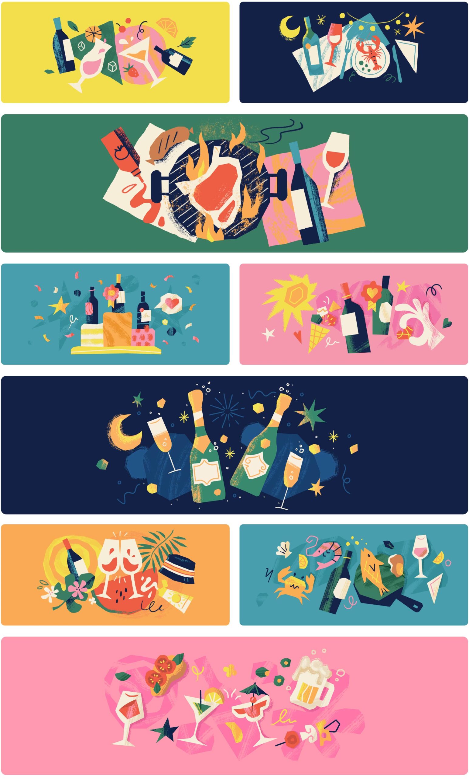
Throughout the ‘Le Petit Ballon-world’, there are many annual events, monthly markets and live in-store promotions, all of which requires custom artwork to add to the unique Le Petit Ballon visual brand language. Below we showcase some of our favourite picks.

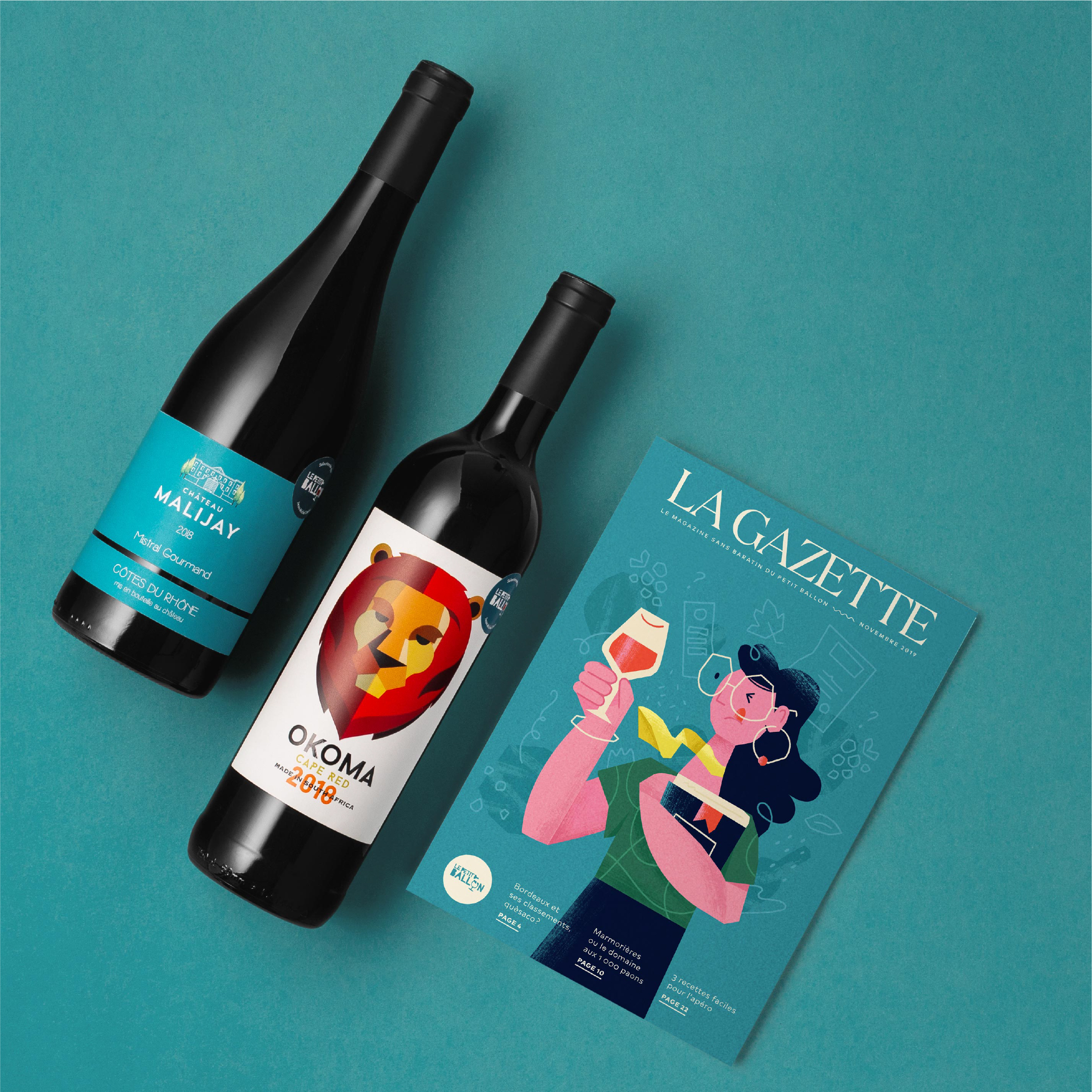
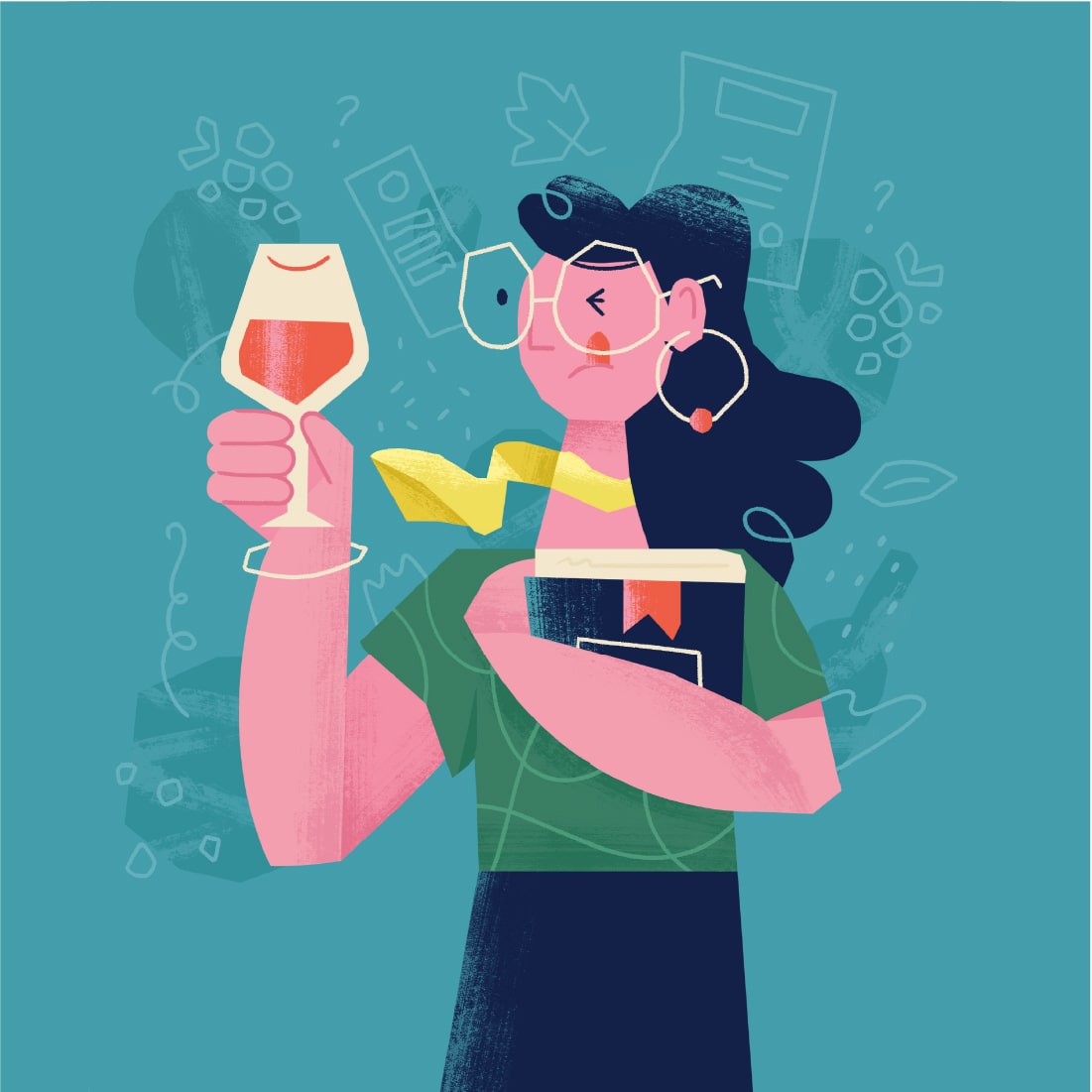
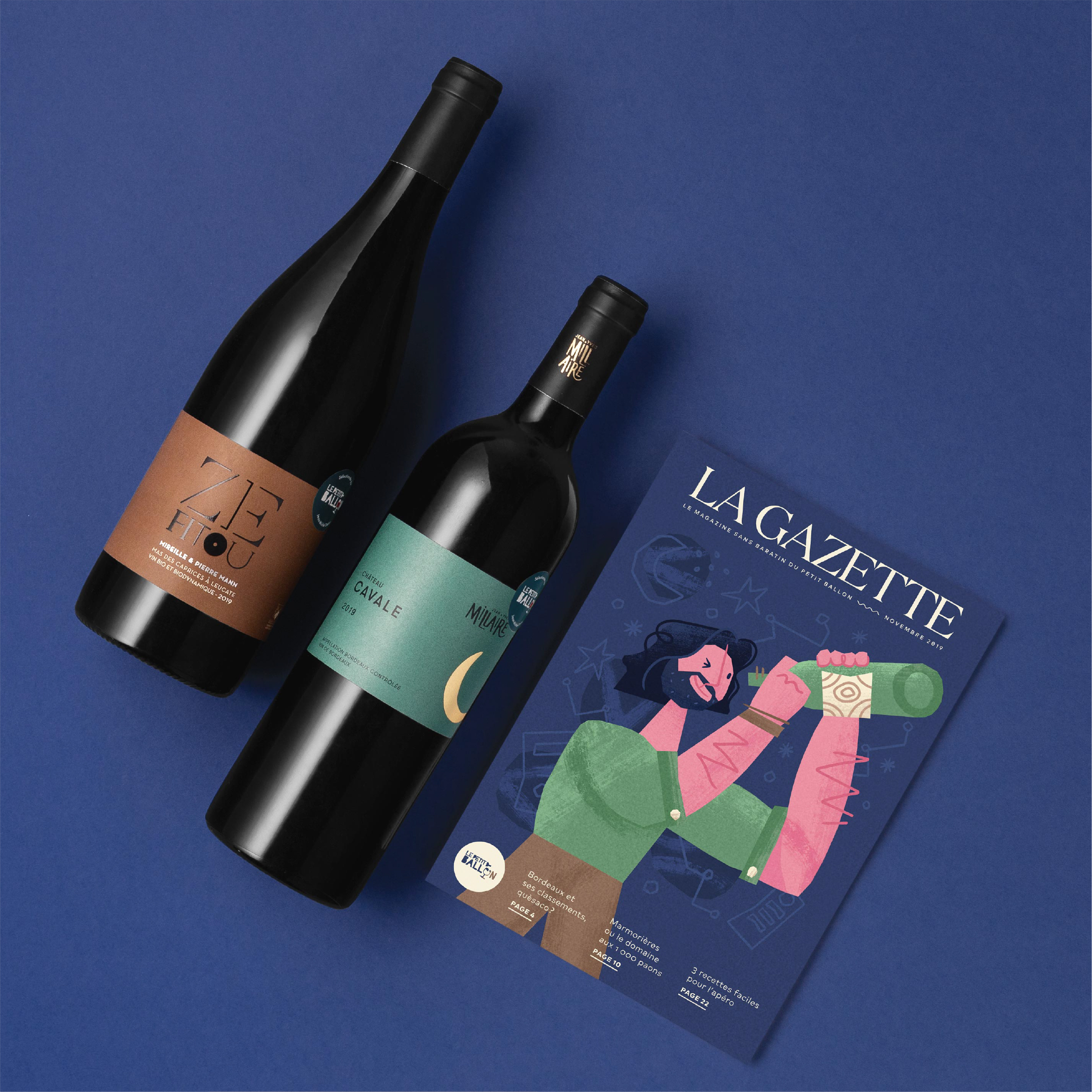
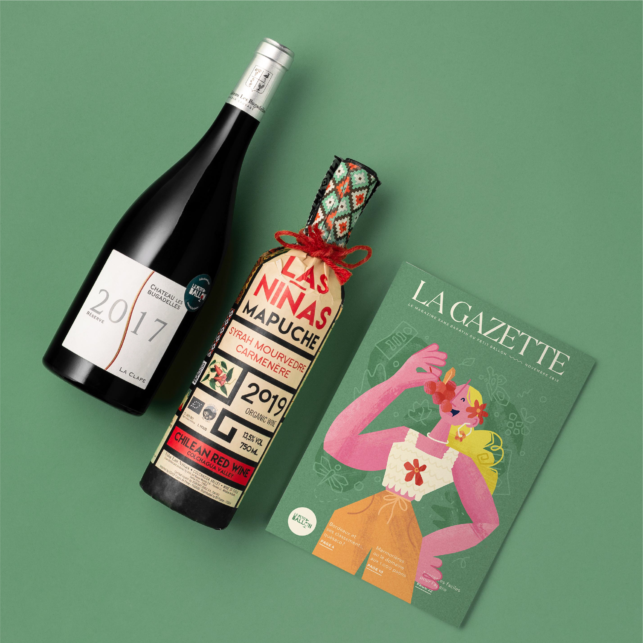
We illustrated a series of magazine covers are specifically designed to welcome new subscribers to the La Gazette family and introduce them to the unique world of wine. Whether you’re an entry-level drinker or an expert sommelier, or have a preference for organic or biodynamic wines, this introduction pages are thoughtfully curated with informative articles, expert recommendations, and stunning visuals to enhance your wine experience.





Thank you
Olivier Kraff & team for 7 years of partnership with Le Petit Ballon.

We’re a creative studio based in Cape Town, South Africa. If you’re ready for a creative brand adventure and truly connect with like-minded folks, then get in touch.